Conventions My media product uses the forms of a real magazine because the front cover contains a large picture on which the main story is about; there are headings on what the main story is about, side stories for what is also featured in the magazine, a large heading to catch the reader’s eye, a barcode, price and date. The contents has pictures of stories that will be featured inside as well as other stories that are included in the magazine which have been page numbered and I have included a website for the magazine which will tell the audience more about my magazine. The main article is a double page spread that includes a large image on the other side there is an interview with who the story is about. There are contrasting colours; yellow and white writing onto a dark green background.
Social Groups
My media product represents particular social groups because it is a rock/hip-hop magazine, which contains artists such as; Muse and Eminem. The majority of people will like these bands as there music has been in films so the bands would have got a lot of attention and promotion. These two genres are separate as in hip-hop males are seen powerful whereas females are seen as sexual objects, which is what Naomi Wolf (1990) found out. Rock is seen as a more male dominated genre however I have used a female rock star as my main image, to go against the stereotypical view. I will be aiming towards lower middle class and upper working class as they are the types of groups that gain a disposal income which will allow them to spend.
Distribution
A media institution that could distribute my magazine would be local shops because the magazine could be placed next to rival magazines such as NME and Kerrang! Music stores because it is a music magazine and gives information on artists and it also could be advertised on the internet. These are places where the majority of people would be. The audience for my media product is 14-24 this is the age group that will listen to music the most e.g. through the phones, so if they have a favourite rock artist it is probable that they will be in the music magazine, this is in the age range of people that would buy a rock magazine and also who listen to modern day rock music and it is a broad enough group to sell my magazine to.
Attracting the Audience
I attracted my audience by making the heading of my magazine stand out, I included a dark blue background which had black writing on top of that I then used blending options on photoshop to add a glow also I used white writing and added a shadow effect around the text, to make it appear more dominant. There was also a large picture to catch the readers’ attention. The headings for the side stories were done in caps lock, the majority of the colouring contrasted with the dark blue background. I incorporated a black banner on top of the music magazine and then wrote in white writing the date and the price for the magazine; which would have been eye-catching for the consumer. The front cover design is vitally important for sales which is why i have kept colours to a small pallet of colours and have used glows and shadows to catch the attention of the readers.
Technology
What I learnt from technologies in the process of making this magazine is I learnt to understand adobe photoshop better, how the majority of the tools work and I learned how to make my front cover, article and contents page look professional, by using tools that will make colours stand out; glows, shadows and inserting rectangles and putting text on top to make them stand out. Looking back at the preliminary task the progression I have made is how to make my magazine look more realistic and how to use photoshop to my advantage. I also looked at good and bad previous magazines to see that I should keep a range on colours, not to go over the top with photoshop options (blending options) and how to take better photos e.g. medium shot, long shot, close up and making eye contact with the camera to connect with the audience.
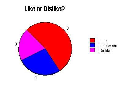
I decided to conduct a questionnaire with 15 people whether or not they liked the magazine. The results were:-


